Case study · Website redesign
De’ Refflesia Wellness Center
A boutique spa that has run out of a George Town shophouse since 2016, with a 4.9 Google rating. None of that reached its website.
The home page
What was wrong
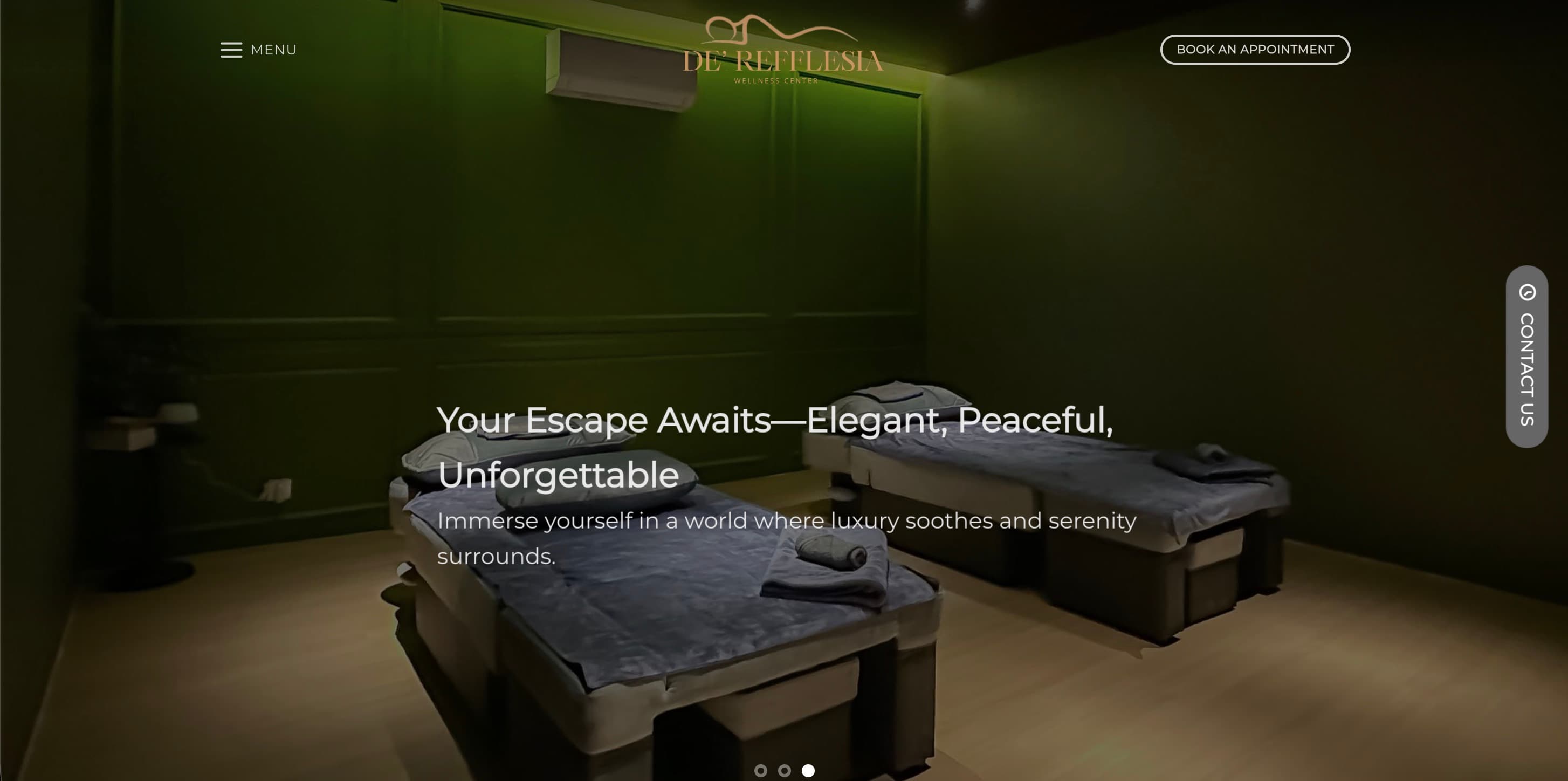
The hero opened on a dark room
A dim photograph of two treatment beds. The building itself — a white heritage shophouse on a George Town street — never appeared anywhere on the page. A visitor could not tell where this place was, or what it felt like to walk up to it.
Every destination sat behind a hamburger
On desktop, with room to spare, the entire menu was collapsed behind a single icon. Services, facilities, reviews and directions all cost a click before anyone knew they existed.
The headline could have belonged to any spa
“Your Escape Awaits — Elegant, Peaceful, Unforgettable.” Three adjectives and no business. Nothing in it was true of this spa in particular.
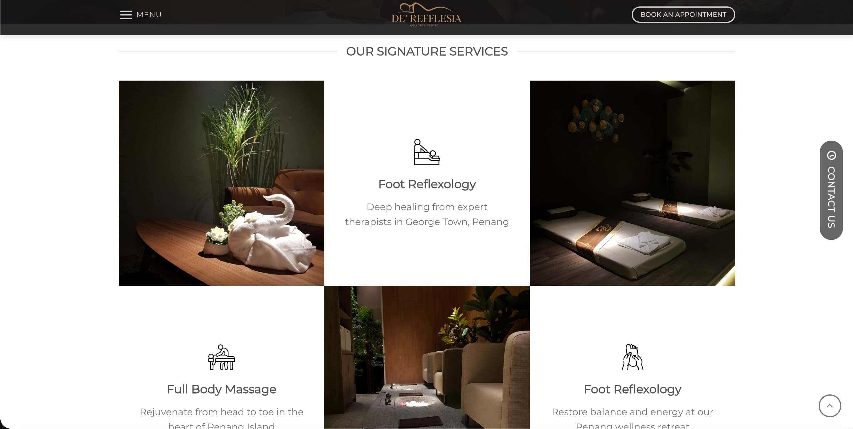
The services section listed the same treatment twice
Foot Reflexology appeared as two separate cards. None of the three descriptions described a treatment — they were location keywords in a service description's clothing (“Deep healing from expert therapists in George Town, Penang”). The card text clipped at the bottom.
Nine years of proof were nowhere on screen
Trading since 2016, a 4.9 Google rating, open until midnight. All of it real, none of it visible without scrolling and hunting.
The photography arrived at full size
Large unoptimised images, served as-is. The page assembled itself slowly on a phone — which is where most people find a spa.
The services section
What I changed
Put the building in the hero
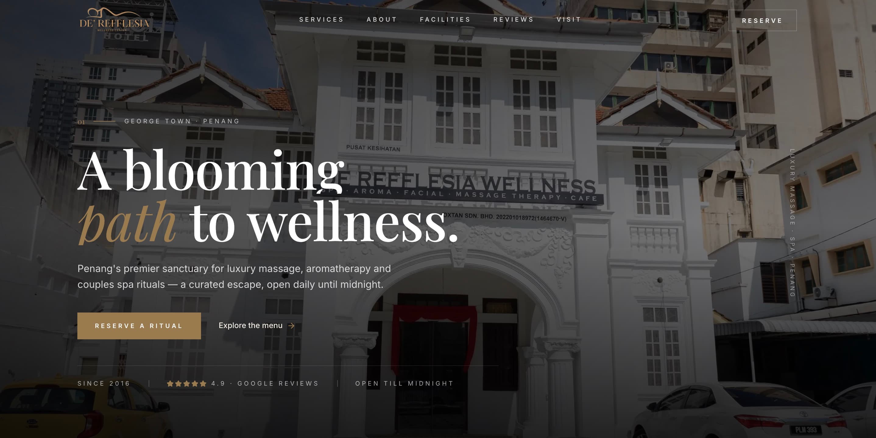
The shophouse is the most distinctive thing the business owns. Leading with it gives the spa a street, a city, and a face before a single word is read.
Opened the navigation
Six named destinations and one reservation button, visible. The hamburger returns only where it earns its place, on narrow screens.
Wrote the headline out of the brand
“A blooming path to wellness.” Rafflesia is a flower; the name was already doing the work, and nobody had used it.
Moved the proof above the fold
Since 2016 · 4.9 Google reviews · open till midnight. A single quiet line under the hero, carrying nine years of trading history that the old site kept to itself.
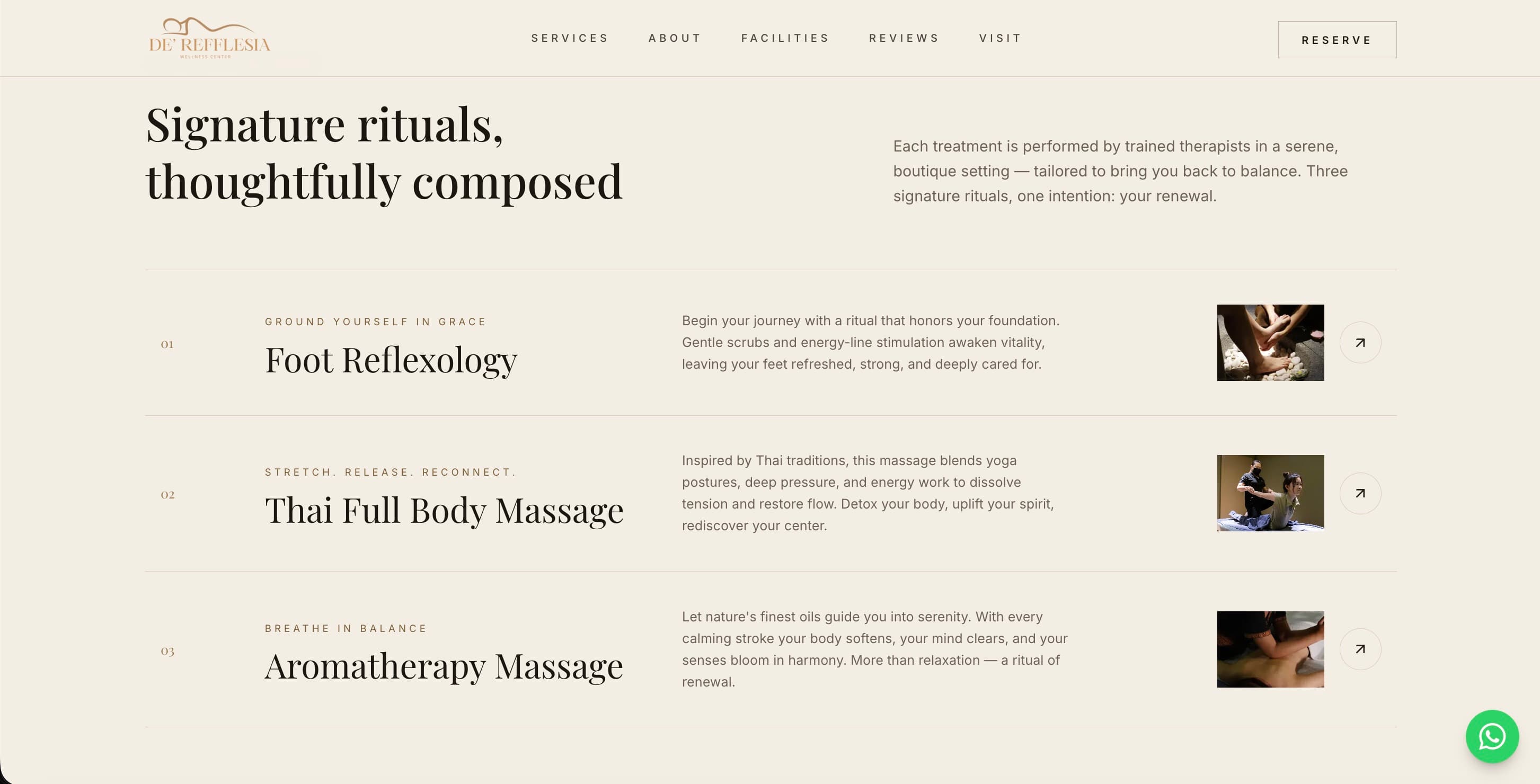
Rebuilt services as an editorial list
Three distinct rituals, numbered, each with an intent line, a description of what the treatment actually does to you, and a photograph. No duplicates. No clipping.
Set a serif against a sans
The rooms are calm, warm and considered. The old site was set entirely in a geometric sans that read as a template. A serif display over a sans body puts the type in the same register as the space.
Made WhatsApp the contact affordance
This is how people in Malaysia actually book a massage. A contact form would have been the tidier design and the worse decision.